Showcase of Tableau Work
A brief showcase of some dashboards I've built using Tableau. These dashboards were built at
a previous employer and as such am not permitted to show any screenshots of them, so instead have created mockups in Basalmiq.
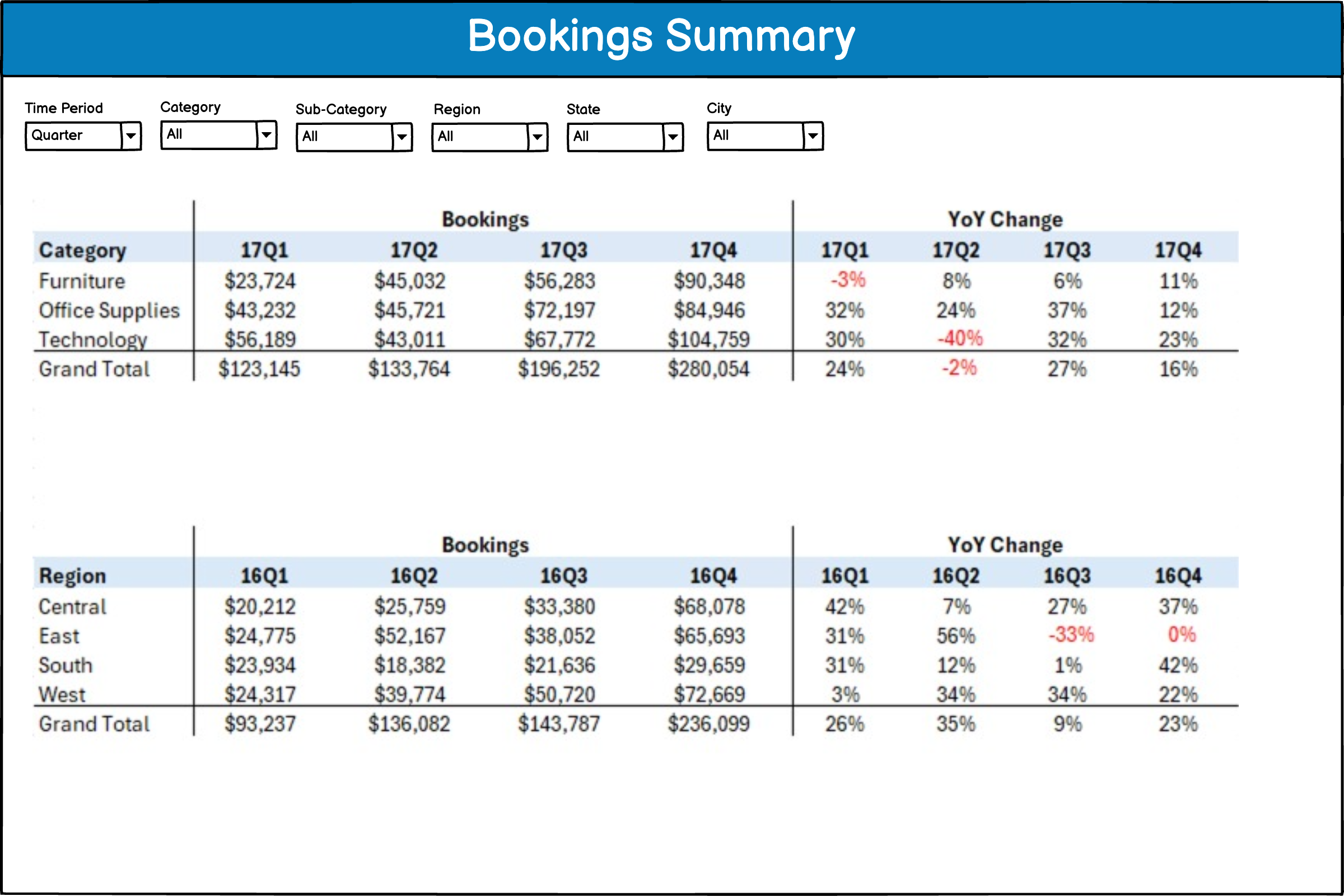
Bookings Summary
This dashboard shows the bookings per selected time period (e.g., year, quarter, month, etc.).
Different tables are provided to show various breakdowns of the bookings such as by geography, market segment, product area, etc.
Filters are provided for different dimensions in the data. Absolute bookings are shown along with YoY change.
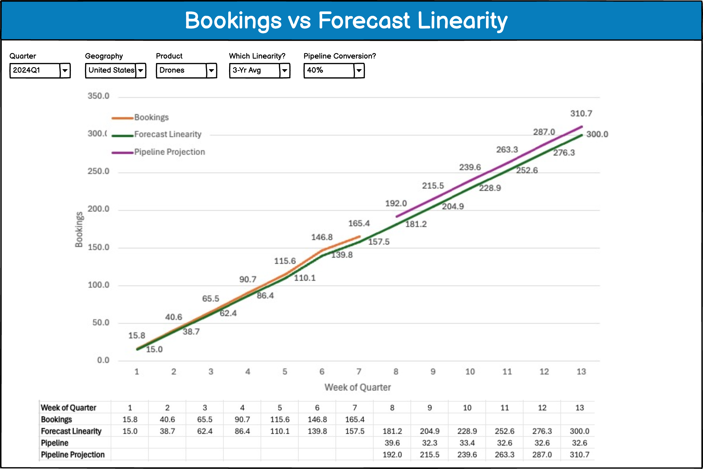
Bookings vs Forecast
This dashboard shows the weekly bookings versus forecast (cumulative) for the current quarter.
The forecast for the quarter is broken up into expected weekly amounts based on historical linearity. As bookings
come in week-by-week, the dashboard shows whether we are above or below linearity and also includes the capability
to predict the remaining weeks based on the status of the sales pipeline in Salesforce with configurable
assumptions of what percentage of the pipeline will convert to actual bookings.
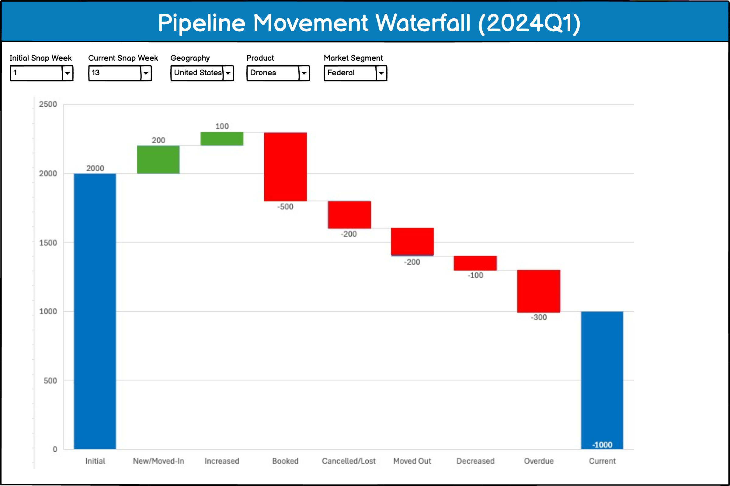
Pipeline Movement Waterfall
This dashboard shows the value of the Salesforce opportunity pipeline at the start of the quarter
on the left (Initial) along with the Current value of the Pipeline on the right. A waterfall chart is used to
account for all the changes that occurred increasing the value of the pipeline (in green) vs changes which reduced the value of the
pipeline (in red).
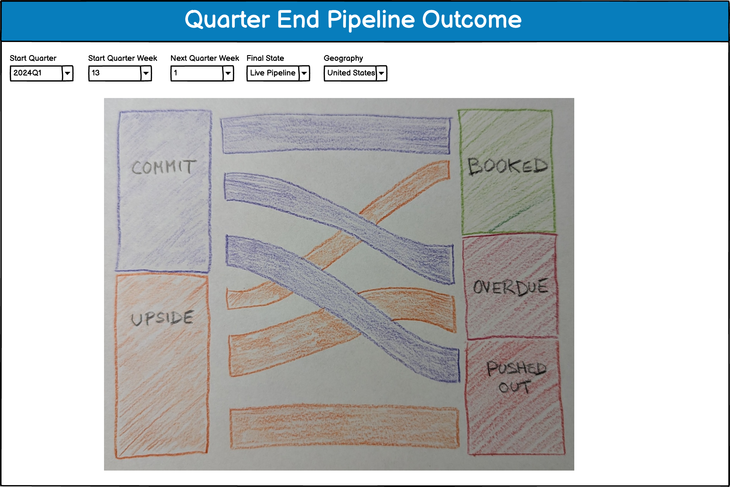
Quarter End Pipeline Outcome
This dashboard uses a Sankey diagram to show what eventually became of active pipeline that was
present in the
closing weeks of the quarter. Each quarter has 13 weeks, so you can for example see what the amount of commit and
upside pipeline was present at the start of week 13 and then see what became of that pipeline. Possibilities include
that the pipeline Booked, the expected book date is Overdue, or was Pushed Out to a later date.
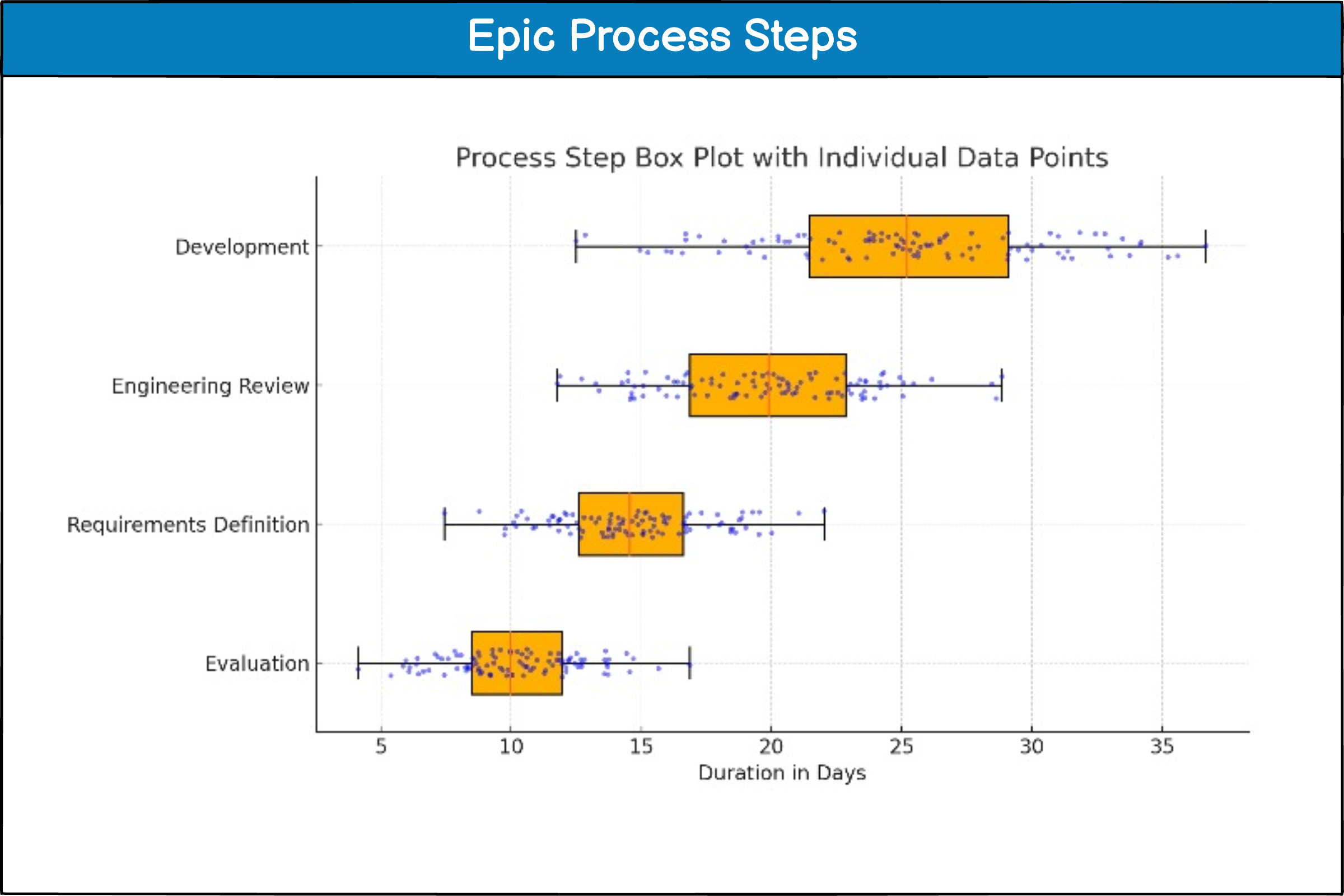
Epic Process Step Analysis
This dashboard uses box plots to compare how long Jira Epics spend in different
process steps.